

I know that new year’s resolutions often get a bad rap, but I happen to be a fan of making them, especially when one of them is to learn new web design trends.
With 80% of resolutions failing within six weeks of the new year, it makes sense that people would be sceptical about making and then holding them. But that’s exactly why familiarizing yourself with and mastering new web design trends is a great one to have.
Unlike “I’ll exercise every day before work”, a resolution to learn new web design trends will directly help your WordPress business. If you’re already in the habit of working on business improvement initiatives (like setting goals for your business and creating strict processes), then this should be a welcome resolution.
Let me explain why:
- It will give you the opportunity to acquire a new skill or evolve one you already had in your web design arsenal
- It could spice up your routine as it breaks up the monotony of following the same old trends, year after year
- It’s a great way to bolster your WordPress business’s competitive edge
I feel like it’s easy to get so lost in our work that we sometimes forget that there are new and exciting things happening with web design on a regular basis. Which is why taking a moment after the new year to brush up on the hottest new web design trends isn’t such a bad resolution to have on your list.
5 Web Design Trends You’ll Want to Promote in 2018
Even if you’re not responsible for doing any actual design work for your clients’ WordPress sites, a major part of your job is being able to recommend what’s best for them. In order to accomplish this, you need to always be on the cutting edge of the latest technology and web design trends.
Before I dive into the web design trends for 2018, I should note that there are some trends that have already started to make an impact on websites. I have chosen not to include these in the list. I'm referring to trends such as video, chatbots, push notifications, SMS, and other forms of real-time communication.
While these web design trends will persist in 2018, I don’t believe there will be many new applications for them this year and so they aren’t worth rehashing in this year’s roundup.
As for webVR and other augmented reality experiences, they are a lot of fun, but I don’t think they are going to be the big universal trend that we are hoping it will be. Sure, it’s great for real estate sites, travel companies, or vehicle manufacturers that want to give customers a close-up look at the “experience”, but I don’t know if this kind of technology will work on most websites. At least not yet.
This list is going to focus on web design trends that we haven’t seen much of in the past and that rebel against many of the “safer” traditional trends we’ve followed since Google’s introduction of Material Design in 2014. I’m also going to include web design trends that are easily executable, whether you’re a seasoned WordPress developer or a WordPress consultant directing clients on what they should be doing.
1. Playing with Color
Color psychology in web design is a very real thing. Choose the wrong color for your logo, your CTAs, or for that new set of product images and you could potentially send your visitors the wrong message.
For a while there, abiding by the rules of color psychology meant sticking to safe choices when it came to creating color palettes and choosing how to apply them to the site.
In 2018, though, websites that want to stand out and make a more powerful impact with visitors will break from that tradition. Color rules still apply, of course. Green means prosperity. Red means danger. Blue is always a safe choice. However, don’t expect these to be the same greens, reds, and blues from years past.
This web design trend will also bring more texture to this bold use of color. Specifically, expect to see more gradients give these bright swatches of color more intrigue and depth.
The symodd digital agency website is a nice example of this playful use of bright gradients.
WordPress developer Anders Hede’s portfolio has a similar vibe: scroll down and experience different colorful gradient panels. While his choice of color palette is more muted than symodd’s, he’s done a fantastic job merging this new web design trend with video.
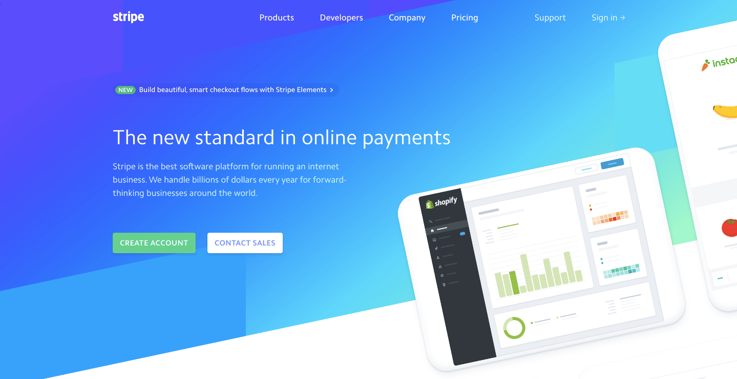
In my opinion, Stripe has always been ahead of the curve in terms of web design. They’ve had this current version of their site up for over a year and it does a good job of utilizing bold colors, gradients, asymmetry, and curves–all of which are smart and modern design trends.
How to Execute
The best thing about this web design trend is how easy it is to execute. You’ll need three tools:
- A color palette generator like Coolors to help you find the right set of complementary colors for your site.
- A color gradient tool like uiGradients to help you create the perfect gradient effect.
- A WordPress theme that’s easy to customize the color palette and design of.
2. Image Effects and Distortion
As colors become bolder, we’re also going to find images becoming edgier. As I see it, this web design trend is in direct response to the sort of entertainment audiences are gravitating towards.
Take Stranger Things, for example.
Or Black Mirror.
Or Orphan Black.
Although these shows each have a unique concept, you can see from their title cards alone how dark and moody the styles have become. While the darkness aspect won’t always translate well over to websites, the moodiness and tech-centricity of the styles most definitely will.
The cool thing about this is that edginess can be expressed in any number of ways in web design:
- Glitch effects
- Corrupted-looking images
- Double exposures
- Funky duotones
- Creative uses of negative space
The form of “distortion” the images take is up to each individual brand to decide.
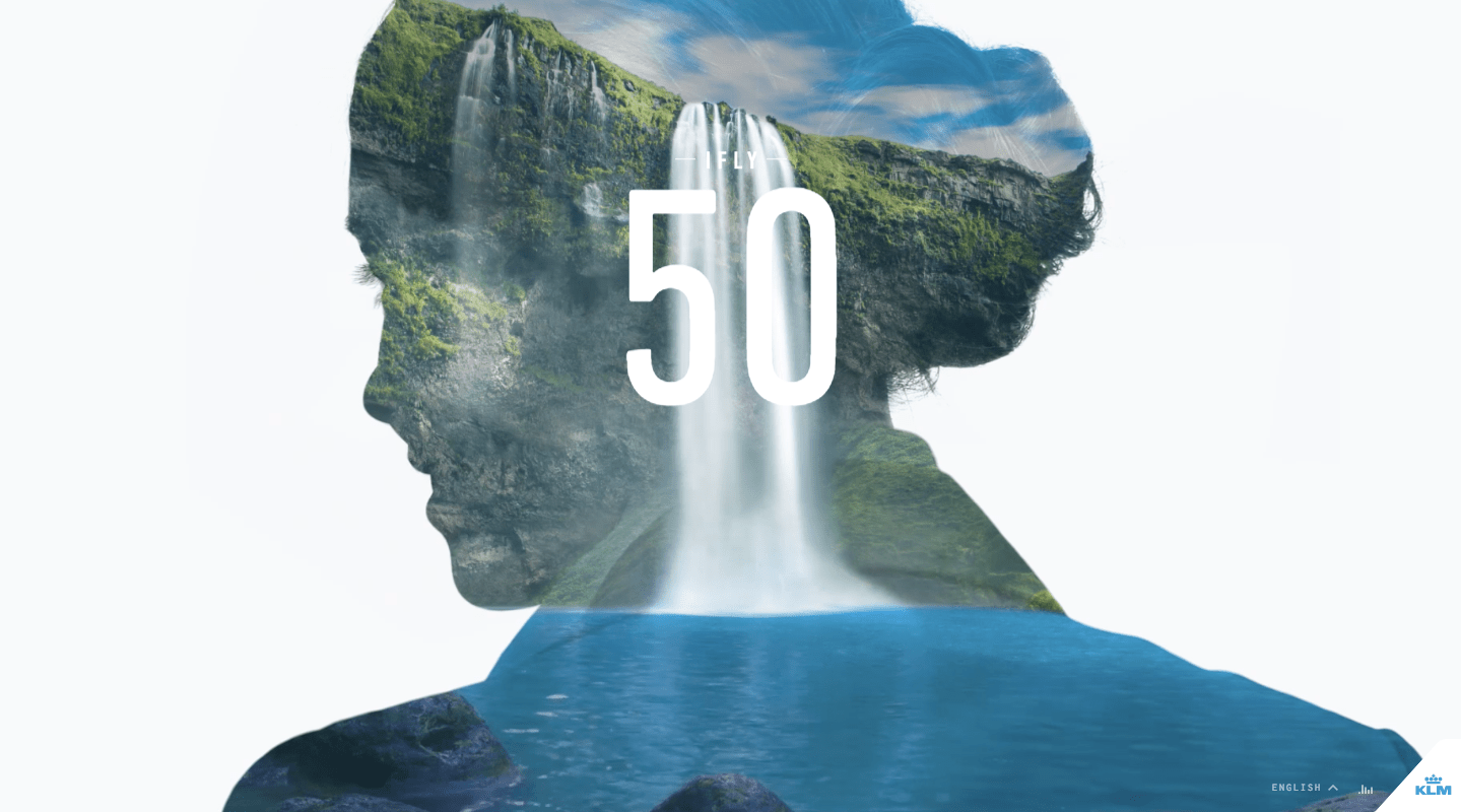
iFly KLM Magazine’s iFly 50 website includes a really cool example of how filling negative space with images can satisfy this trend. As you scroll through, you’ll encounter small touches of this throughout as well.
Web design Joao de Almeida’s portfolio uses a glitch effect on the header cinemagraph, which is a neat design choice. It gives you the sense that what you’re about to view will surprise you.
If you’re looking for a simpler application of distorted imagery, check out Rocka’s use of double exposure photography in the header of its website.
How to Execute
In terms of how to pull off this distorted image trend, it depends on the style you want to use. There are ways you can create certain distortions using design software like Photoshop and there are ways you can do so with a CSS or JavaScript snippet. Whatever you aim to do, though, it’s easy to find a quick tutorial that will teach you how to execute properly.
3. Friction in Typography
When it comes to typography, you have to be very careful. It’s similar to color psychology in that you don’t want to mess with the inherent formula that works; however, you still want to see how far you can push those boundaries in order to break free of the norm.
In the case of typography, this translates to header text on the home page. There really aren’t any other places on the website where you’ll want to flex your creative muscles because readability of text is crucial to getting your message heard. That said, there’s absolutely nothing wrong with playing around with the home page header text. This is a great way to give your site an edge if you don’t want to mess around with photography and still want to play it safe with color.
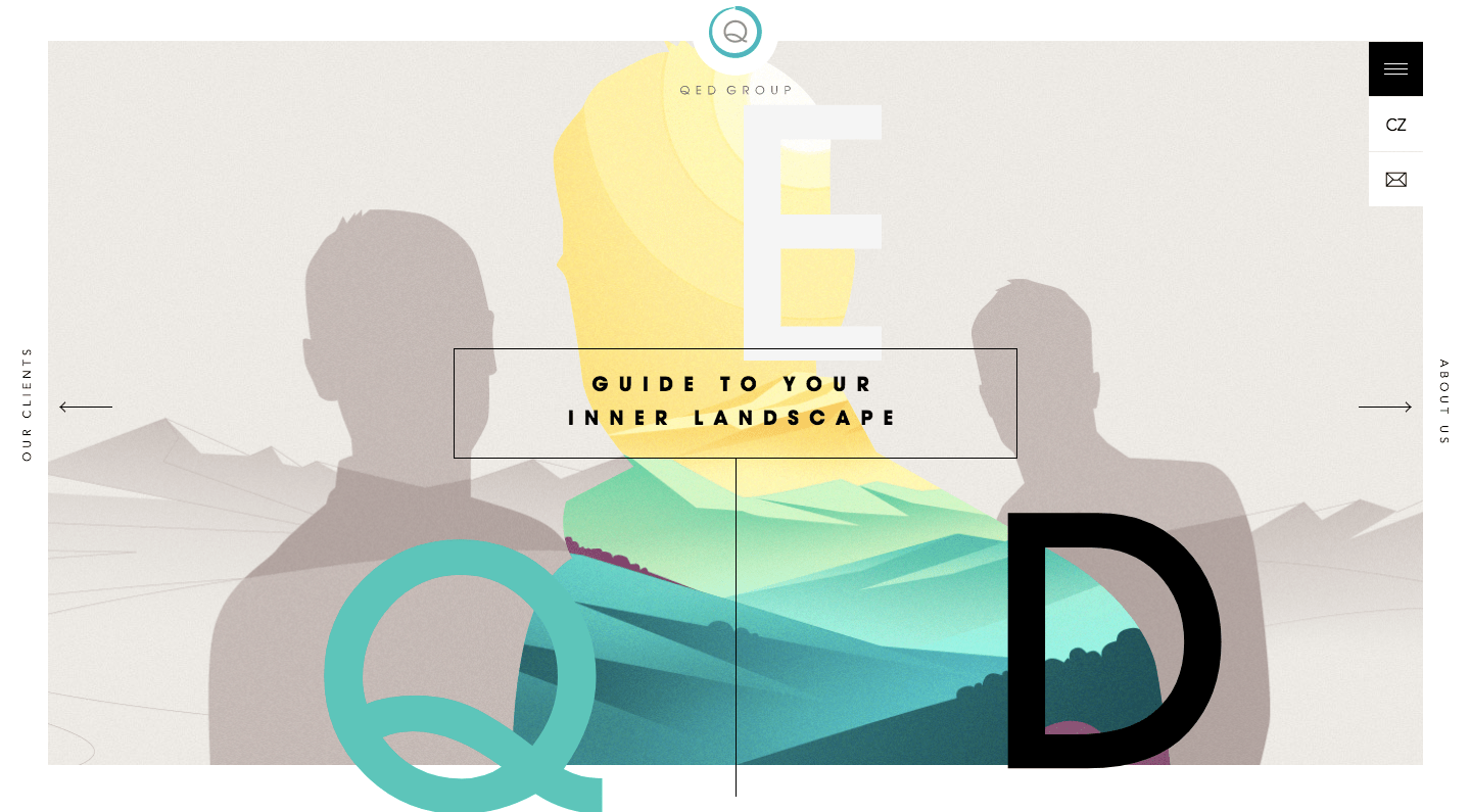
This trend of using oversized type, but not necessarily placing it in a logical order or horizontally-aligned as QED Group has done is something you’re going to see a lot of this year.
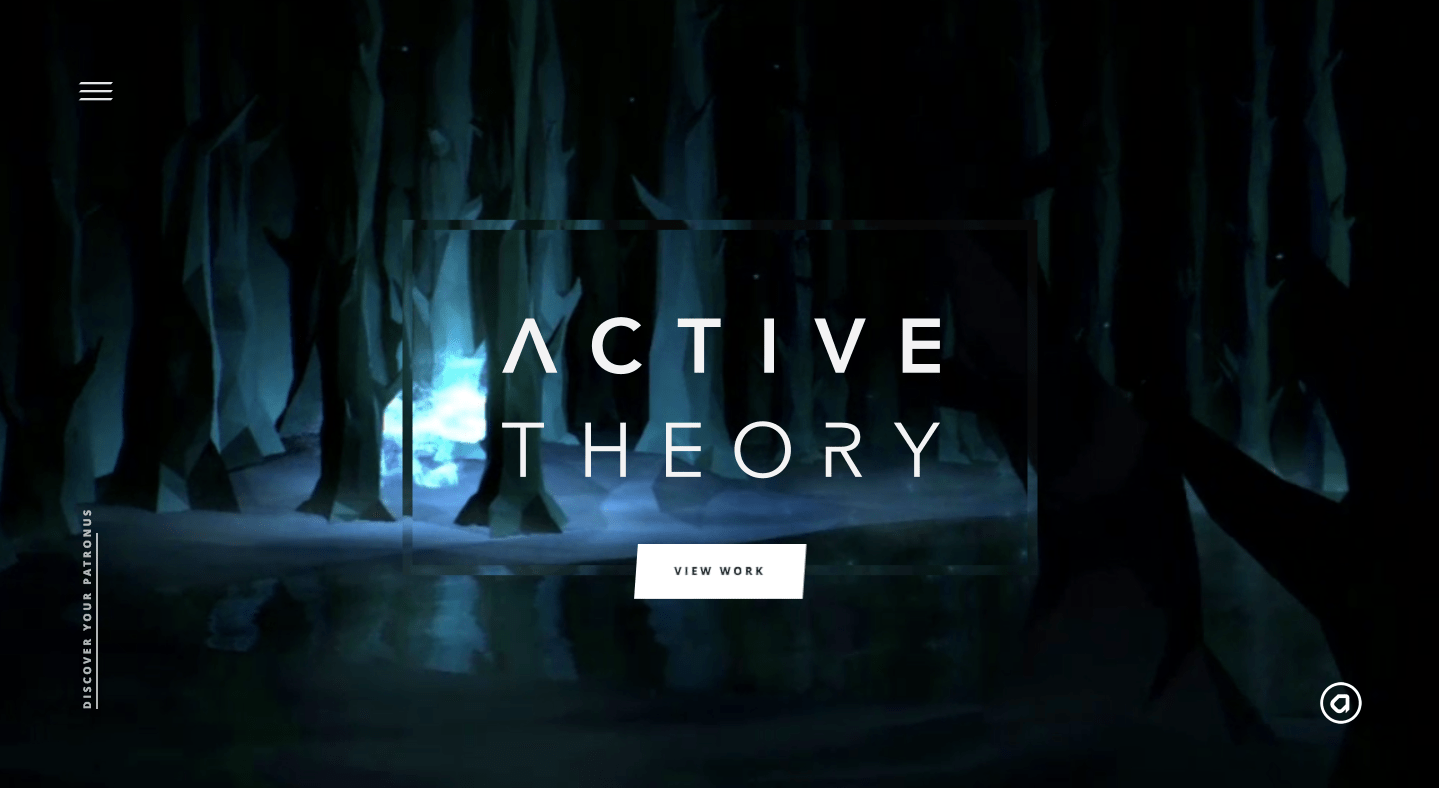
Here is another typography style you’re likely to see a lot of and one that I think goes hand-in-hand with the edgy, tech-friendly image trend. This example from Active Theory is what I call an “incomplete” font design.
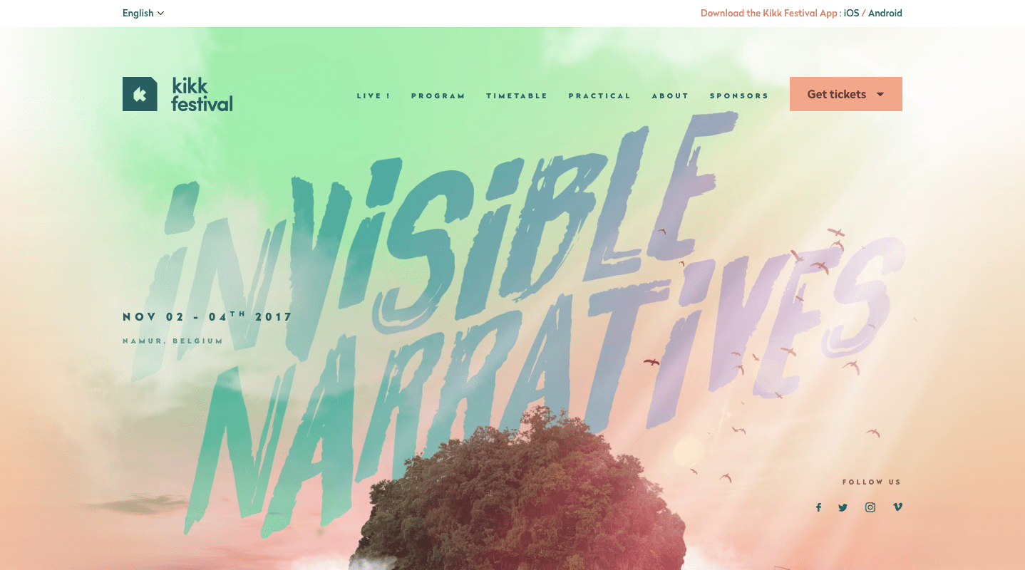
Other creative typography choices will continue to pop up on websites this year. However, you’re more likely to see them used in layers behind or on top of physical objects as the KIKK Festival website has done.
How to Execute
Your WordPress theme should already give you plentiful options for fun fonts that you can use in your design. However, if you’re looking to find that one font that will push the right buttons and accent your design in the right way, you may want to use a free font repository like Font Squirrel.
4. Soothing Animation
When animation was first introduced in web design, I mostly saw it as a cover-up for slow-loading pages. Then, once we got better at optimizing websites for speed, web designers were able to apply animation effects to pretty much any element of the site they wanted to.
With all this upheaval with colors, images, and fonts in 2018, it looks like animation is going to slow down a bit. Not necessarily in how often it’s used in web design (that will never go away) but in terms of how fast the actual animation is.
I think we can thank the video background trend for this one. Video backgrounds have demonstrated that video doesn’t always have to serve an explicitly explanatory purpose. Sometimes watching a beautifully constructed video on mute is just as effective in creating a mood – and this is what cinemagraphs and particle background animations will do.
UX Design Studio Heco’s header animation is simple and yet really engaging. There’s something about that movement that makes you want to explore the site further, perhaps because it’s something you don’t often see online.
Calm is great if you’re trying to be mindful of your mental health. Many of the brief meditations they provide come in this cinemagraph form. Basically, they’re just animated images that you can watch on loop over and over again.
The elje Group has another cool example of this smooth, relaxing animation trend on their website. This one also makes sharp use of the color and gradient trend.
How to Execute
If you’re a fan of this web design trend, it’s important to note that this might not be the easiest one to implement as it requires a solid knowledge of design software. For cinemagraphs, you’ll need to use Photoshop. For particle backgrounds (slow animations), you can code it by hand or use a JavaScript plugin.
5. Unpredictable Grids
The final trend I want to call attention to is the unpredictable, or broken, grid web design trend.
These last few years we’ve been taught that responsive design works best when websites are built in a modular grid. That way, each unit of the grid can easily break away, resize, and rearrange itself based on the size of the viewing device. This year, however, we’re going to see web designers break away from the traditional grid system.
Granted, this doesn’t mean they’ll discard the grid when planning and constructing a design. That will always be there in the background. However, what we’re presented with will appear less rigid in terms of abiding by those gridlines.
The Amaiò website is a good example of how this works. Here is how it looks as you scroll through the desktop version of the site:
And here is how that same site looks as you scroll through mobile:
As you can see, the grid still exists. They’ve simply shaken things up when it comes to aligning images, filters, and text directly against those grids.
The Collective[i] website is another example of how to disrupt visitors’ expectations when it comes to the grid. Here is how it appears on a desktop:
While this one still abides by the standard rules of modularization, it does not play by the rules of symmetry. Obviously, the split screen won’t work on mobile, so they’ve adjusted it so that the left screen becomes a peekaboo element:
How to Execute
Start with a comprehensive guide that covers how to design a CSS grid for your WordPress site (like this one from Smashing Magazine). Then, consider all the ways in which you might break the grid with your design. Remember: this trend is less about breaking the rules and more about presenting the illusion that you’ve done so.
Wrap-Up
With everyone obsessed with this idea of self-improvement and transformation as a new year gets underway, why not take this opportunity to jump on the bandwagon and make it work for your WordPress consulting business?
It’s an easy resolution to start – Firstly, brush up on the hottest web design trends in 2018. Then, find unique ways to integrate these sharp new design touches into your clients’ websites. Your work will remain cutting-edge and keep your business far ahead of the competition that is stuck in the past.