


Colour can put people at ease. It can shock. It can delight. It can evoke a sense of nostalgia. In other words, colour is an incredibly powerful tool for a WordPress designer.
That said, a striking colour palette isn’t what’s going to make prospects convert. It’s the words on the page that tell your story, make a connection and really drive home why converting is in their best interest that does that.
That’s why you have to be incredibly careful with typography on websites. Font selection, spacing, size, weight — all of these things can affect the comprehension and retention of the words on the page. Throw colour into the mix and it gets even more complicated.
Choose the right colours and you could enhance all the other choices you’ve made in the way of content for your site.
Choose the wrong colours and… Well, it won’t be good.
The following post is going to explore the juxtaposition between typography and colour and provide you with tools to ensure that the colour choices you make don’t stand in the way of conversion.
What You Need to Know About Typography and Colour
In order for visitors to convert on a website, it must make a compelling argument and be a pleasant experience from start to finish. Typography has a huge role to play in that.
That said, it’s not as simple as:
“I’m going to use black text on a white background so no one has any problems reading it.”
The colour choices you make for typography and what sits behind it probably aren’t going to be that simple.
For starters, you have to consider branding and how the colour of your content fits with the design on the site. Secondly, this isn’t the early days of the web where pages were littered with endless streams of words and little else. Websites have much more diverse structures and content types now. If you want to impress, you have to be creative.
So, here’s what you need to know when designing with typography:
Is Black Text Acceptable?
According to Google’s Material Design guidelines, black text is best for light backgrounds. Granted, these suggestions are for mobile app design, but what applies to mobile apps should work just as well for mobile (and desktop) websites.
While I’m typically reluctant to deviate from anything Google officially puts out into the world, there are some design experts who suggest that black is not ideal for website text.
Adam Schwartz, a designer for Cloudflare, put together a guide on the “Magic of CSS”. In this guide, he has an entire section devoted to colour. It’s here that he says:
“The sharp contrast of black on white can create visual artifacts or increase eye strain. (The opposite is also true. This is fairly subjective, but still worth noting.)”
The rise of screen dimming and night mode are proof enough that staring at a stark white screen for too long can be bad for us (not to mention all the studies that tell us it’s no good). And since your goal is to get visitors to pay attention to your content and read it all the way through, black-on-white might not be the ideal combination.
But don’t go switching all of your clients’ typography from black to grey right away. Google, Schwartz and others suggest that black text at a reduced opacity is best.
Material.io demonstrates how you can use various levels of opacity to demonstrate emphasis in your content, too:
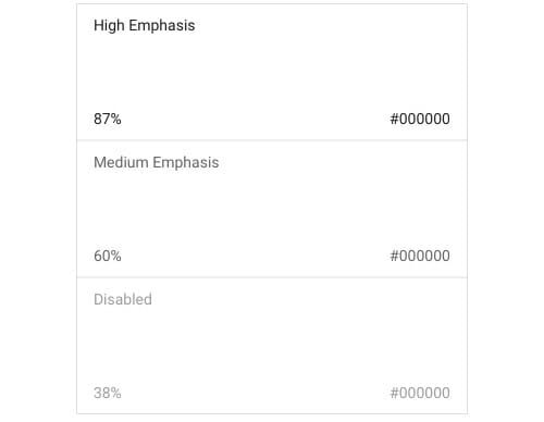
Bottom line: For the main body text of blog posts and other pages that require lots of reading, you’ll want some version of black text.
Is White Text Acceptable?
Reverse text, or white text on a dark background, is becoming more and more common in web design. In all honesty, I don’t know that it should be — at least not as extensively as some web designers use it across their sites.
Based on a study from Colin Wheildon, the author of Type and Layout: Are You Communicating or Just Making Pretty Shapes?, white text on a dark background leads to a significant decrease in comprehension of the message.
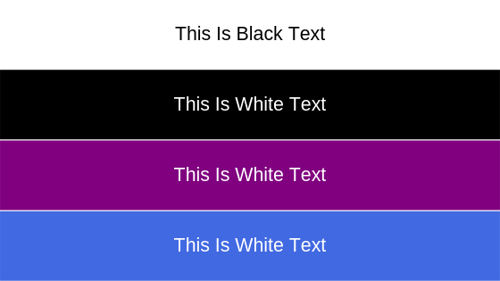
These were the survey results:
- Black-on-white: 70% good, 19% fair, 11% poor
- White-on-black: 0% good, 12% fair, 88% poor
- White-on-purple: 2% good, 16% fair, 82% poor
- White-on-blue: 0% good, 4% fair, 96% poor
In other words, white text can compromise how well your message is understood by visitors.
That said, I think there are benefits to placing white text on top of dark colours to establish mood and bring focus to specific parts of a website. Just make sure it sits atop something that doesn’t further distract from the words — like a busy background image or texture.
Bottom line: To really use white effectively, it should be used sparingly and in high-contrast environments. Specifically, white is great for short subtitles or headlines.
Can Other Colours Work in Typography?
As we’ve already seen, experts in these matters have no problem with designers using shades of black in typography. But what about everything else?
Take the Agency Mavericks Blueprint page, for example.

There’s neither black-on-white nor white-on-black here. So, does it work? Or do we need to talk to Troy about getting this redesigned ASAP?
There’s actually nothing wrong with using other colours in typography. For the most part. There are, however, a couple of things to be mindful of for the sake of accessibility.
Contrast
The Web Content Accessibility Guidelines, stipulate a minimum ratio of colour contrast needed for websites.
At the very minimum, your websites must have typography set to a colour contrast of 4.5:1 against the background.
Here’s an example from the Web Accessibility Initiative of why that should be:
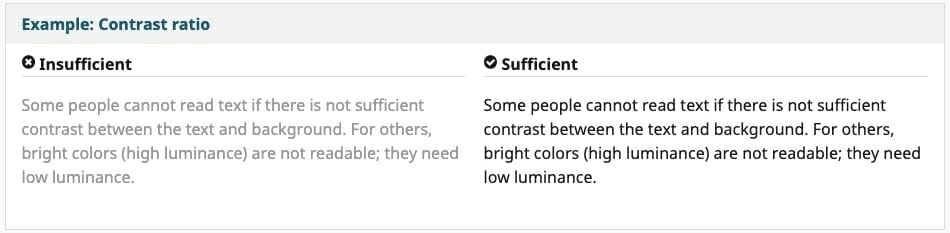
Lower contrast type doesn’t just hurt the readability of content, it makes it near-impossible for visually-impaired readers to consume.
Colour Blind-Friendliness
Think that the colours you’ve chosen look great and have a stark enough contrast? Just make sure the colours chosen — especially if using them to highlight certain parts of the text (like hyperlinks) — can be seen by colour-blind visitors.
My apologies to anyone who actually is colour-blind, but I want to quickly demonstrate how the choice of colour might not be perceived well with this graphic from Usabilia:
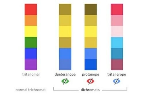
As Usabilia suggests, there are ways to signal to colour-blind users that there’s something special about the coloured text you’ve used (even if they can’t see it). While textures only really apply to blocks of colour, you can use other tricks like placing symbols next to coloured text, adding an underline to hyperlinks upon hover and so on.
Bottom line: Google Analytics may tell you what parts of the world visitors came from and which device they used to view the website. But it won’t be able to tell you about visual impairments that keep them from being able to read your content. So, express caution when using colours other than shades of black or white for typography.
Which Tools Should You Be Using?
Finally, let’s take a look at a couple of typography colour tools you can use to make lighter work of this.
Canva Color Wheel
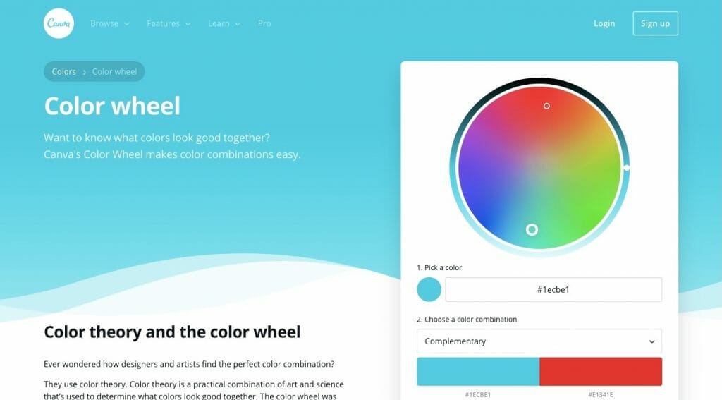
Truth be told, Canva is an amazing tool for anyone wanting to build out smaller pieces of their website or for other marketing channels. But did you know that Canva has a Color wheel to help you find the perfect set of colours?
You can use it to find the perfect colours for all the text on your site. This would also be helpful if you want to use colourful typography on the homepage and in other blockier sections of the site.
It’s simple to use and you get easy access to all the HEX codes, too:
If you’re having a hard time trying to figure out how you want to play around with colour in your typography (or elsewhere on the site), give this tool a shot.
WebAIM Color Contrast Checker
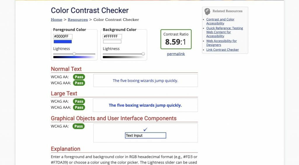 There are a number of tools you can use to check the contrast of typography online, but WebAIM is one of the better options.
What I like most about it is that you get a preview of colour pairing and then tells you what the contrast ratio is. There’s no need to try to decipher any of the results yourself.
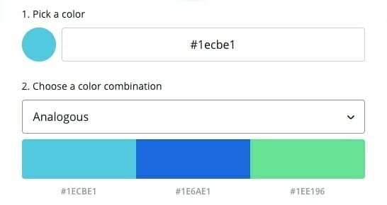
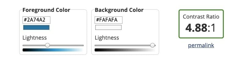
So, let’s say you found some colours you like from the colour wheel. You’re just not sure if the shade of blue you want to use for hyperlinks will contrast enough with the white background. All you have to do is take the HEX codes and run them through this tool.

In this example, the blue isn’t dark enough.
What’s nice about this tool is that you can darken or lighten the foreground and background colours right from within it.
As you move the slider, the ratio adjusts so you can see if you’re still on track. Once you’ve nailed the ratio and you’re happy with your colours, you can add them to your web design!
Wrap-Up
You want to give visitors the best experience possible, which means grabbing their attention with a stellar design and carrying them through to conversion with valuable content. But what if the colour choices you’ve made for your typography prevent that from happening?
I realise that typography isn’t the most exciting of topics, but it’s important to consider how colours used for the content or space behind it affect readability, comprehension and general visibility.