


The Google mobile-first indexing initiative is coming down the line very soon. And, since we already know that more users are accessing websites through mobile devices, should we even need Google to tell us that mobile UX is a priority?
No, of course not. But that doesn’t necessarily mean you’ve covered all your bases in ensuring that clients’ sites play by the mobile-friendly rules dictated by Google’s search algorithm. If the success of their businesses depends on how well their sites perform in search, then this needs to be front and center on your radar this year.
So, let’s jump right in. Let’s uncover what this mobile-first indexing actually means for your WordPress business and how you can go about preparing your clients for the switch.
What is Google Mobile-first Indexing?
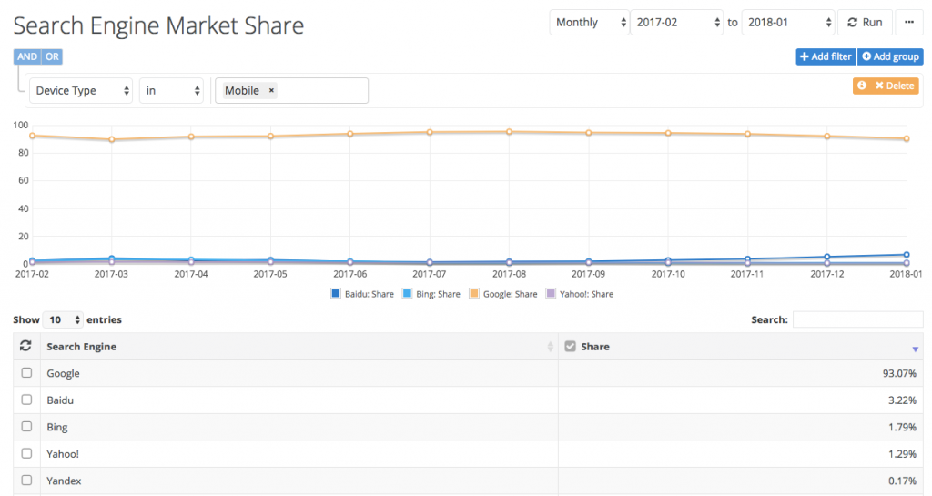
Look, Google’s been trying to make the digital world a mobile-friendly place for a long time. Remember Mobilegeddon in 2015? It makes sense that they’d have such a vested interest in the mobile-friendliness of the web, what with over 93% of all mobile users relying on Google to power their searches:
So, what exactly does this mobile-first indexing mean and how does it differ from previous algorithmic updates that favor mobile-friendly websites?
Well, for starters, this isn’t about encouraging mobile design best practices. That’s already been tackled in years past. Google assumes we’ve got that part nailed down. This is the primary aim of mobile-first indexing:
“Although our search index will continue to be a single index of websites and apps, our algorithms will eventually primarily use the mobile version of a site’s content to rank pages from that site, to understand structured data, and to show snippets from those pages in our results.”
That’s what Google said when they first announced this initiative in 2016. It’s been a little over a year and we still don’t (fully) have mobile-first indexing in place. With good reason.
It’s not that Google has seen the error in its ways and decided that the desktop experience is fine to use as a primary ranking factor. In fact, Google recently announced that it’s still going full-steam ahead with this. The team just needs more time to ensure that the new indexing procedure doesn’t throw the whole search engine out of whack.
And why would this potentially create a mess in search? Well, if they switched it on today and webmasters and developers haven’t taken care to make the best impression with the mobile versions of their sites… well, the rankings would be a mess. It’s Google’s hope that, by the time this rolls out: 1) most websites will be mobile-ready, and 2) there won’t be much of a difference between the quality of desktop and mobile experiences and ranking won’t even change that much.
As of writing this, Google is rolling this indexing update out in batches. Right now, websites that they’ve assessed and determined are ready for mobile-first indexing will be included in this first wave. Once they’ve monitored the effect this has on their search rankings, they’ll move forward with more.
Knowing this, how do you currently feel about the state of your clients’ WordPress sites? Are you nervous that the switch from desktop-favored indexing to mobile-first will have a significantly negative effect on their search rankings? If so, let’s take a look at what you need to do now to prepare your WordPress clients for the Google mobile-first indexing switch.
How to Prepare Your WordPress Clients for Google Mobile-First Indexing
If you’re feeling confident that you’ve prepared your clients well for Google mobile-first indexing, then you won’t have much to worry about right now in terms of getting their sites in line. That said, there’s a great opportunity here for WordPress consultants to reconnect with older clients or to reach out to brand new ones that are at high-risk for penalty from this change. You just need to be able to clearly identify them.
Whether you’re looking to revamp your current WordPress site-building and mobile optimization processes, or you want some leverage in discussions with clients in need of a revamp, use the following list of tips to get you moving in the right direction.
Tip #1: Assess the Mobile-Friendliness of the Site
Google has provided us with a number of tools to test the mobile-friendliness of WordPress sites. They’re a little rudimentary, but they’ll at least give you a solid base to work from which will help you weed out the really bad websites in need of help immediately.
Here are the tools you need to use:
Google Search Console
Google Search Console is the first place you should go if you have any questions about why Google is doing what it’s doing to your site in search. If there are errors detected, security breaches noted, or any other penalties they might hold against you, you can uncover them here.
As it pertains to mobile-first indexing, however, focus on the following:
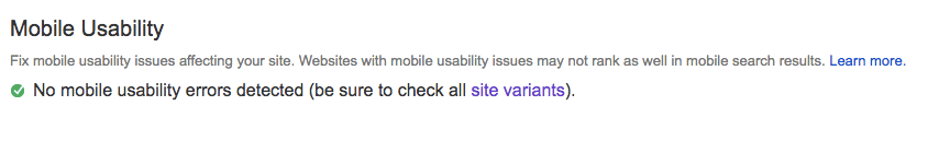
Search Traffic > Mobile Usability: This test will tell you if there are any immediate mobile usability errors that need to be addressed.
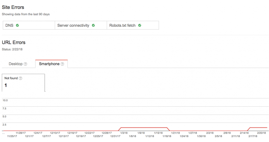
Crawl > Crawl Errors: This test will crawl your site as Googlebot and tell you if any issues were detected. In other words, are there broken links? Are there files or scripts that are unavailable? And so on. Make sure you check for URL errors on Mobile.
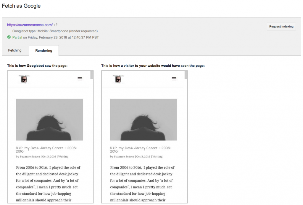
Crawl > Fetch as Google: Pay close attention to this one as Google is going to start showing snippets of your site in mobile search results. If you’re not happy with how the mobile site looks, then now is the time to change it.
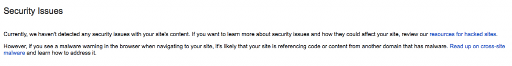
Security Issues: Also, don’t forget to look at what Google says about security issues on your site. For starters, there should be an SSL certificate in place as Google will be strictly enforcing the Chrome penalty starting July 2018. Secondly, if your site has been deemed insecure, Google will tell you here if it’s been blacklisted.
Google Mobile-Friendly Test
The next test to run is the Google mobile-friendly test.
Upon entering the site, enter the full web address, including “https://” if your site has an SSL certificate. Run the test and let Google tell you whether or not your site is mobile-friendly:
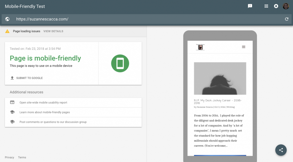
As you can see with my test, Google says that my site passed; however, there are page-loading issues. If you’re provided with a note like this, be sure to click through and find out what’s wrong and what Google suggests you do to repair them. Anything you can do to make your site more mobile-friendly, the better.
Google PageSpeed Insights
Also, you’ll want to test your site on Google PageSpeed Insights. A site’s search ranking doesn’t just depend on the quality of content served on mobile or the security of the site, speed matters too.
Again, be sure to enter your web address in full so that Google can assess the correct version of your site (it will automatically default to “http://” if you don’t specify otherwise).
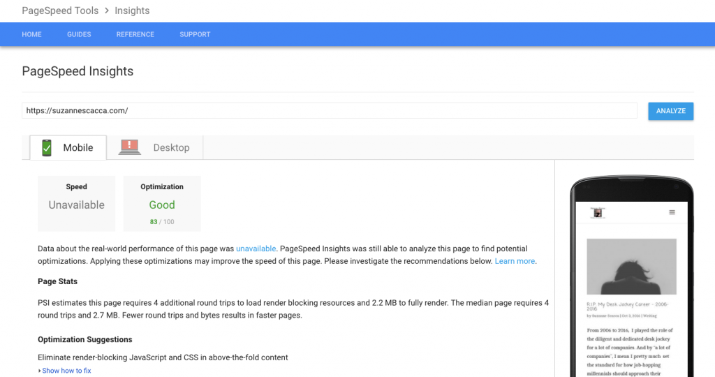
A score that shows up in green is good, yellow is okay, and red is bad. Even with a green score, though, Google might still have suggestions on how to improve the loading speed of your mobile site. Be sure to take note.
Google Structured Data Testing Tool
Last, but not least, you should use Google’s Structured Data Testing Tool.
Basically, we use structured data on our websites to inform search engines on what the page is about: who it’s authored by, what kind of content it is, what the topic is about, etc. Search engines like Google can then, in turn, use this information to create rich snippets of it when promoting it in search.
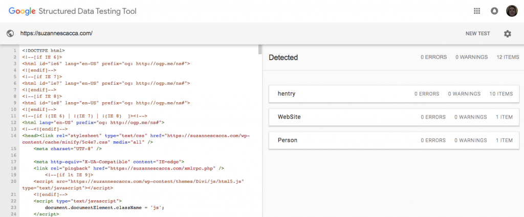
If your site is missing the mark on structured data, Google will tell you where to look and what to do.
Tip #2: Get All Primary Content on Mobile
In the past, it might have been okay to leave some of the primary content off the mobile site because of space considerations or because you didn’t think it was a critical element to have. However, with mobile now being the primary indexing factor, you need to ensure that all primary content for your site exists on mobile. Of course, it needs to be done in a way that looks good, but if you feel it’s essential for your visitors (and Google) to see, it needs to be on there.
Tip #3: Review and Amend the Content
In addition to getting all requisite content on mobile, you also need to assess the quality of what’s there. For instance, on a larger desktop screen, it might not matter if your blog posts are full of lengthy paragraphs or if page titles and descriptions run too long. On mobile, these kinds of things matter, so you need to find a way to best display your content within the limited real estate.
Think about the following:
- Keep all page titles, header and subheader text, and anything in larger, bolded font shorter in length.
- Never let a paragraph run longer than five lines.
- Use plenty of text breaks where you can: bulleted lists, listicle formats, supportive imagery and videos, etc.
- Write less, in general. 600 to 800 words might not be a big deal for a Services page displayed on desktop, but it might be too much on mobile. Consider gutting your content if it’s full of unnecessary or repetitive information.
Now, the above suggestions mainly pertain to the readability of a page on mobile, but there are other considerations to make here too.
Take keywording, for instance. Your site may be optimized around simple search terms like “Italian restaurant”, but wouldn’t it make more sense to optimize around a term that accounted for local search intent?
Now, that doesn’t mean you need to alter all your keywords to long-tail search terms. In fact, that might work against you. That type of keywording makes sense for desktop as users have a full keyboard readily at their disposal. For mobile users, many of them might not want to type out that many words or might instead rely on voice-activated search. So, the way you keyword your site should account for the ways in which mobile users are most likely to search for it.
Tip #4: Make the Site 100% Responsive
Everything on your WordPress site should be responsive–the design, layout, images, embedded videos, social media widgets, contact forms, navigation… EVERYTHING.
Thankfully, this isn’t a difficult thing to accomplish.
For starters, make sure you have a responsive WordPress theme installed on the site. If your clients are managing their own sites and are uncomfortable using or customizing a theme, then suggest they use something like Beaver Builder instead. It’s a fantastic page builder plugin (a plugin Simon recently recommended) that takes a lot of the guesswork out of designing responsively and designing well.
Also, if you’re installing plugins to create elements like contact forms, pop-ups, calls-to-action, and so on, make sure you use ones explicitly labeled as responsive. You don’t want to have to bother with manually coding device breakpoints. Just use something that a plugin developer already had the foresight to create with mobile responsiveness in mind.
And since I mentioned pop-ups, let me make a quick mention of that here as pop-ups continue to be a heavily-used element in web design:
When Facebook user Jamie asked the Agency Mavericks team, “What’s everyone standing on pop-ups for desktop only?” , the response was basically to listen to Google.
In other words, Google isn’t telling anyone that pop-ups are bad on mobile. They’re just saying you shouldn’t use them in a way that degrades the experience. Specifically, Google will penalize your mobile site if you use pop-ups in the following ways:
- An interstitial pop-up that serves as the entry point of the site. Users are then unable to access the site unless they exit out of the interstitial.
- An interstitial pop-up that sits at the top of a web page, but can be bypassed by scrolling down.This requires users to understand that it’s one that can be scrolled past and not one that’s X’ed out of, which can create confusion.
- A pop-up that covers the main content of the page and disrupts the experience.
So, the moral of the story here is to just focus on designing your site and all its various elements in a way that won’t intrude on the mobile user’s experience.
Tip #5: Review Server Bandwidth
This one isn’t going to affect most of you, but I want to include it here as Google has mentioned this previously and I want to make sure we’ve covered all our bases.
This one doesn’t have to do with increased traffic to your web server because mobile-first indexing will somehow increase organic traffic to your site. Instead, this is for anyone who has created a separate mobile site and it exists on a separate server.
Until now, Google has only sent its bots out to crawl desktop sites. However, the mobile-first index will now direct Google’s bots to your mobile sites. If those sites are set up on a server not intended for heavy traffic, then the new crawling procedure could potentially harm your bandwidth. So, if this one pertains to you, take heed and adjust the server’s bandwidth requirements now.
Wrap-Up
Don’t look at Google mobile-first indexing as a punishment or penalty. When Google brought the hammer down on black hat SEOs or anyone else looking to game the system, that was a punishment. But updating the algorithm to improve the user experience–your users’ experience–is meant to encourage better web design practices on your part and, consequently, a better experience for all in the long run.