


If you're paying for ads or running an email marketing campaign, then it's important to direct this traffic to a high-converting landing page. You need to build this page specifically for the campaign because if you direct the traffic to your home page, there are too many distractions and not enough of a focus on a single offering.
There are quite a few elements involved in making this a powerful tool to increase sales. So if you're not sure what makes a high-converting landing page or even how to make one… then here's your complete guide.
What is a Landing Page?
A landing page is a web page that is created specifically for a marketing or advertising campaign. It could be a sales page for a particular product or service. Or if your goal is to get them into your sales funnel, then you would add a downloadable resource such as a helpful e-book or template. This means that they can get to know and trust you before they buy from you.
By having a single focus on your landing page, it greatly increases the conversion rate because a homepage has too many options which can steer them away from the primary conversion goal.
How To Sell Landing Pages
If you're a web designer who is creating landing pages for clients, a good way to price and sell them is to use the “Go Wide Go Deep” method and ask the client a lot of questions to figure out what the value of the page will be to their business.
From there, you work backwards and ask:
- How many leads can we generate per month?
- How many can we convert?
- What’s the lifetime value of these customers?
Work out how much it will cost you to generate that landing page and make sure you are delivering that service as a profit.
Using Elementor to Create the Prototype
The plugin that Troy used for this prototype is Elementor. The free version is awesome but you can upgrade to a pro version to get few more features and more support. It's fast and easy to use and it also allows you to build a template and then export it to any website so it can be used for multiple clients.
Get the full tutorial with Troy here.
The Elements For a High-Converting Landing Page
The Heading
You need to make a headline that grabs the readers attention and make them want to keep reading. However, it also needs to say exactly what you do in simple language. For example, I have no idea what this company does and I didn't bother to find out:
For readers, confusion = can't be bothered figuring this out = I'm outta here.
You also want to make sure that the keywords that brought this visitor to your landing page are included in the headline as well.
Clarity
Troy touched on the importance of clarity when it comes to creating your UVP in this post, but the same goes for your landing page. You have to keep it simple and be able to express what it is you do as quickly as possible. Don't use long sentences or big words that may take the reader's attention away from the purpose of the landing page. Get to the point and get there quick. No need for fluffy sentences with big words.
Remember: Confusion = site abandonment.
Have a Clear CTA
- If you include a navigation bar on a landing page, it can be a distraction from the primary conversion goal.
- Use a contrasting colour for the button so that it stands out.
- Make sure that the CTA is above the fold.
- If your landing page has a lot of detail, then it's really important that you sprinkle the CTA throughout the sales copy so that they don't have to go searching for it.
There are so many other variables to your CTA that can increase conversions. So I'm just going to point you here to some really interesting stats on what others have done to increase their conversion rate.
The Safety Net CTA
Although there is some research to show that if you have only one CTA that it will increase your conversion rate, it might be interesting to split test including a safety net CTA.
There may be people who aren't ready to buy from you, so if you include a secondary CTA you can at least capture their email address and then put them into your sales funnel. This way, they will get to know you and see that you're trustworthy before they buy.
A good example of a safety CTA is from Ramit Sethi – if you're not ready to buy the book, you can download the first chapter for free:

Social Proof
In order to build trust, it's good to include testimonials from happy customers. If you can add videos or photos that also helps it to appear more credible. Take, for example, our Client Acquisition Formula landing page:
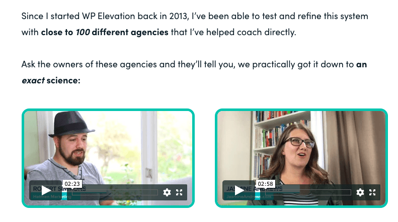
Side note: Make the the “play” button obvious so they realise it's a video and it makes it more enticing to click.
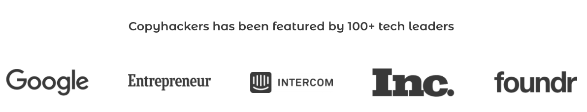
You can also add logos from reputable companies, however, you need to explain why you're adding these logos. Are they happy customers? Did they give you an award? Did they mention you in a blog? Make sure it's clear why those logos are there. Here's a good example from Copyhackers:
The “So What?” Test
There's a helpful little trick that is known amongst the copywriter crowd. It's called “The So What? Test”.
When you're writing something, you need to look at it and ask… “So what? What's in it for me?”
By doing this it will help you uncover the real value and why your reader should care about it. It's simple, but it works!
Anticipate Objections
One thing we do when we are launching a course is to listen to our audience. If there is a frequent question or concern that is being raised, we need to know what it is and make sure we help them overcome that objection in the sales copy:
Match the Copy & Design From Your Email
Research from Silverpop found that successful landing pages grab attention quickly by matching the copy of the promotional call-to-action as well as the look and feel of the email or ad that captured their attention. The slight confusion of arriving at a landing page that doesn’t match the email or ad can lead to site abandonment.
Forms Need to Be Short and Sweet
The other day, I came across a resource that seemed quite interesting, so I clicked the download button and was faced with this:
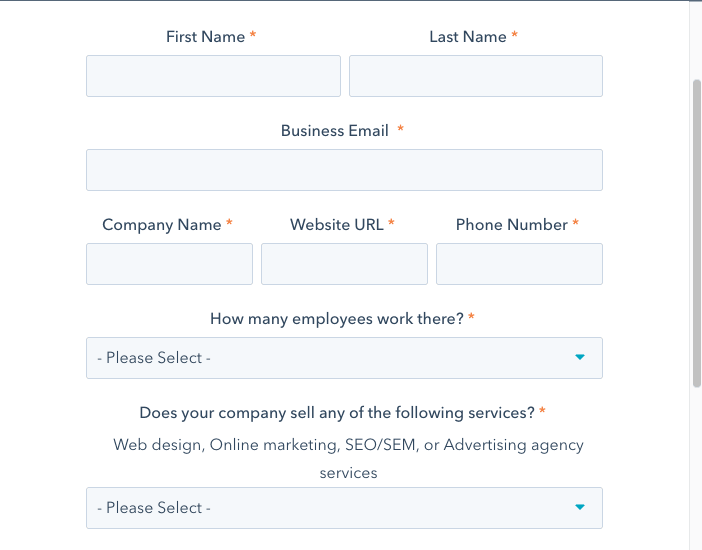
Say what?
I don't want to tell you my life story to get your resource that, let's face it, could be really crappy. I could probably get the same information in a blog post from someone who doesn't ask for my life story.
You see, if you make things too hard or timely for a prospective customer they will most likely abandon the process.
I can totally deal with this though:

Side note: I love this CTA “Hook Me Up”- it's different, cool and non-salesy.
Which leads me to my next point…
Be Authentic
People can sniff a sales pitch a mile away which creates mistrust.
Your audience will connect with stories, with people that they resonate with and truth. If someone emotionally connects to your brand – you're winning. Which is why many marketers say that having a face and personality as your brand is quite powerful.
The Design
- Make sure the text easy to read by using a good-sized font that isn't too thin. Also, try not to use reverse text too much as this can increase eye strain.
- Use an image that helps to explain what you're offering and something that might be appealing to your audience. If you use an image that is inconsistent with the copy, then that can cause slight confusion which = site abandonment.
- Don't use sliders!
- According to Silverpop, it's best to use centred, single-column landing pages.
Grammar
If your copy has spelling or grammar mistakes, this can create mistrust, so make sure you get someone to proof your landing page or at the least, use Grammarly.
Use a Tripwire Product
A tripwire is a product that allows you to turn a lead into a customer by making it a low-cost, relatively painless offer. It's usually something such as a handy template or e-book for a cost under $20. Then once you have their trust and deliver above and beyond, it is then easier upsell to them.
To read more about creating a tripwire product, check out my post here.
Split Test
Split testing is probably the most important element of creating a high-converting landing page.
I've given you some stats and recommendations here, but everyone's audience is different and what could be right for our audience might be totally different for yours. It's actually remarkable how a simple change such as a colour or the wording of a CTA can increase your conversion rate.
Here's our guide to split testing.
Wrap Up
That's it for this week.
I'd love to hear what tests you have run and what you have found works best! Leave us some advice in the comments below!
And stay tuned for the “Ultimate Guide to Tripwire Offers”.